Voted #1 Framework For WordPress Page Builders
Automatic.css (ACSS) is consistently voted the best framework for WordPress because it combines innovative features, True Builder Integration™, best practices, unparalleled support, and education.

-
I was hooked when I first used ACSS and realized I could quickly achieve a responsive Oxygen website without spending hours messing around with media queries. Automatic.css speeds up development and makes it super easy to create complex layouts….
Why do WordPress designers & developers use a framework like Automatic.css?
Ask about ACSS in any page builder group, and you’ll likely see dozens of recommendations for Automatic.css. Here’s why…
Frequent Updates
Fast Bug Fixes
Vibrant Community
Unbeatable Support
Innovative Features
Education & Training
Frames Ecosystem
Frequent Updates
Fast Bug Fixes
Vibrant Community
Unbeatable Support
-
No decision fatigue
Start building your site in minutes with minimal setup. Then breeze through page building with simple classes and tokens for common styles.
-
Effortless design consistency
Achieving & maintaining perfect consistency with colors, shades, spacing, and typography across an entire site has never been easier.
-
Automatic mobile optimization
ACSS removes 60-90% of the work required to get your websites looking fantastic on mobile devices. It’s a dream for responsive development.
-
Maintainability & scalability
The sites you build with ACSS will be the most scalable & maintainable sites you’ve ever built. You can even re-theme an entire site in seconds after it’s launched.
-
Limitless flexibility
Most utility frameworks are rigid and limiting. ACSS was the first utility framework to offer total flexibility across every important area of the system.
-
Best practices, support, & education
ACSS provides an unparalleled level of support, education, and training, while consistently advocating for industry-wide adoption of best practices.
THE INTANGIBLES!
Build scalable, maintainable, and consistent websites with hardly any effort
Setup and adjust your sites styling with a simple dashboard and then build your site with ACSS’s classes and variables. That’s it – your site is automatically responsive, scalable, and maintainable. Learn more below!
-
Set (or swap) your website’s brand colors in seconds
Define your brand colors and experience the magic of automatic shade & transparency generation. Easily reference colors, shades, and transparencies using user-friendly utility classes and simple variables. Need to make small adjustments to different shades? You can do that, too. This is color management without limitation.
-
Enjoy fluid responsive typography out of the box
Say goodbye to managing text sizes across breakpoints. Just set the base size for your typography, choose a scale value, and watch your headings and text scale fluidly across all devices. Best of all, you can override any individual text or heading size with your own min and max values in seconds.
Automatic fluid responsiveness!
😎
Display H1Display H2Display H3Display H4Display H5Display H6 -
Get beautiful spacing rhythm on every site with zero effort
Consistent spacing in web design creates visual rhythm. That’s why Automatic.css’ spacing options are based on mathematical scales. Enjoy harmonious designs while retaining flexibility through simple spacing options you can easily adjust. This is effortless visual balance!
Space it out!
😃
-
Build any layout in seconds with responsive grids and columns
Unlock the power of flexible layouts with Automatic.css. From basic to advanced, this unique framework offers utility classes and variables for both flexbox and grid layouts. Our automatic grids reduce breakpoint headaches and our innovative “Flex-Grid” feature solves common issues with uneven grid children. ACSS simplifies development and helps you create stunning layouts with ease.
It’s stupid simple
🤯
-
Create maintainable components with simple styling tokens
Having one source of truth for global element styling is crucial for maintainable web design. This is where Automatic.css excels. Simply style elements using a custom class and ACSS variables for consistency, efficiency, and maintainability across your entire website. And yes, it works perfectly with class organization methods like BEM.
Style the card component!
😱
Card Component
This is an example card component. Build it with ACSS variables and you’ll never have to copy & paste styles or elements, mess with limited presets, or manually change styles one-by-one.
Solve common development headaches with a few clicks
Automatic.css is built for freelance and agency work. As part of that vision, we’re committed to solving common challenges and headaches that real web designers face on a daily basis. This has led us to develop “quality of life” features that no other framework on the planet offers. Once you use them, you’ll never want to build another website without them (our apologies).
-
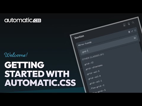
Build without guesswork thanks to cheat panels & live preview
Worried about learning the entire framework? You don’t have to be! Automatic.css has handy right-click contextual menus that let you easily see the classes and variables available for a given style and add them directly within the page builder in a single click. Even better, you can live preview exactly what a class or variable does before you add it. Using ACSS requires no real memorization or guesswork.


