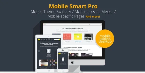
Mobile Smart Pro
The top theme switching mobile toolkit that allows you to manage your mobile-specific content and URLs for your WordPress site. Switch domains
MOBILE-SPECIFIC MENUS, MOBILE HOME PAGE, DISABLE PLUGINS ON MOBILE DEVICES, DISABLE WIDGETS ON MOBILE/TABLET/DESKTOP, DOMAIN SWITCHING, AND MOBILE-SPECIFIC VERSIONS OF PAGES
Note: currently the www.mobile-smart.co.uk site is down – apologies for the inconvenience, we are working to fix this. If you have a support query, please go to http://mobilesmart.freshdesk.com/ and open a ticket there.
Live demo at http://www.mobile-smart.co.uk/ (compare site on desktop and mobile device).
Standard Features
Mobile Smart Pro offers all the features of the free Mobile Smart plugin including:
1. Mobile Device Detection: high quality mobile device detection
2. Theme Switching: switch to a mobile theme of your choice when a mobile device views your site
3. Footer Switcher: allow user to switch between mobile and desktop version (template tag or widget)
4. Tablet Mode: enable/disable switch for tablets such as the iPad and Android tablets.
5. plus developer features like template tags to allow developer to customise your theme to different devices, and a boilerplate ‘unstyled’ theme.
6. CSS classes to enable you to style based on the tier of device, e.g. tier-iphone, tier-tablet. Support responsive design with user-agent detected CSS.
Premium Features
In addition, Mobile Smart Pro includes the following premium features:
6. Domain switching: redirect users to m.yoursite.com and/or switch theme when user arrives at m.yoursite.com (requires you to change some DNS and web hosting settings). Domain switching allows you to maintain one WordPress site for mobile and desktop, but present different domains for mobile and desktop users. Other options allow you to: a) Only switch themes when on the mobile domain b) Only allow access to mobile domain when on mobile device. c) New: option to maintain separate mobile and desktop WordPress sites, and redirect from mobile to desktop, as well as the other way around.
7. Mobile/Tablet Post redirection: redirect individual posts / pages / custom post types to a custom URL when visited by a mobile device or tablet.
8. Mobile Pages: mobile-specific rich text content on the same edit screen as your main content (works for all post types), and mobile excerpts for post types which support excerpts.
9. Mobile Menus: set up mobile-specific menus for simpler navigation, and map your desktop theme menu locations to your mobile theme menu locations.
10. Mobile Home Page: set a different page to be your mobile home page, when you
11. Mobile Plugins: disable specific plugins when a user views your site on a mobile device or tablet. E.g. disable caching plugins, or disable plugins that may slow your theme down.
12. Mobile Widgets: disable selected widgets when a user views your site on a mobile device / tablet / desktop through a checkbox on the widget in a sidebar slot on the Appearances -> Widgets page.
13. Mobile Shortcodes:
is_mobile: [is_mobile]some mobile-only content[/is_mobile]
is_tablet: [is_tablet]some tablet-only content[/is_tablet]
is_desktop: [is_desktop]some desktop-only content[/is_desktop]
14. Test mode Append ?testmobile=true to your URL before theme switching is enabled, to test the mobile site before enabling switching for all users.
15. Multisite compatible The plugin will show the current allowed themes for each multisite subsite.
Google SEO Compatible
Mobile Smart Pro is compatible with Google Webmasters and Google indexing rules to prevent duplicate content or SEO cloaking. Note: The mobile version of the site is marked as rel=”alternate”, the desktop version of the site is marked as rel=”content”, when you have mobile domain switching set.
The plugin also sends the HTTP Vary: User Agent header by default (option to disable) which is recommended by Google as best practice to inform the Googlebot-mobile to perform a second crawl as a mobile device. Note that this tends not to work well with caching plugins.
Domain Switching
Domain switching will switch the whole path, e.g.
http://www.mydomain.com can be redirected to http://m.mydomain.com, and also http://www.mydomain.com/parent-page/child-page?page=3 will redirect to http://m.mydomain.com/parent-page/child-page?page=3 (The choice of subdomain, e.g. m.mydomain.com is completely your choice, it could be www.mydomain.mobi, etc. It should be configured with your DNS settings and your server hosting to point the mobile domain to your desktop site).
Compatibility with other plugins
Gutenberg, Visual Composer, Divi, and other page builder plugins Mobile Smart Pro is compatible with the main new Gutenberg editor.
Mobile Smart Pro is also compatible with page plugins such as Visual Composer and Divi. It is important to note that for the Mobile Pages functionality, Gutenberg and the page builder tools only display on the main editor, rather than the mobile editor.
Caching plugins Mobile Smart Pro has been tested with WP Super Cache, WP Total Cache, and WP Rocket. Each of these should be configured to not cache mobile devices, or to cache mobile devices separately. We are looking at ways to improve caching on mobile devices.
If you find the mobile theme is displaying on desktop, or vice versa, it will often be because your caching plugin has cached the mobile theme, and you will need to set up your caching plugin correctly for mobile devices. See more here.


Reviews
Clear filtersThere are no reviews yet.